
Have you ever wondered what has made dating sites like Tinder or Bumble so well-received by millions? What is it about these dating apps that draw in so many singles from across the world? What are the qualities that make these platforms the popular choice?
The Answer Right Upfront
An excellent mobile app design can make a dating site or matchmaking service stand out and become popular with the public. The same can be said for an intuitive user interface that lets you scroll through profiles enjoyably without much of a learning curve. And this seems superficial, but how the dating app looks and feels can significantly impact how customers receive it.
Let’s look at some of 2026‘s popular dating apps and how user experience and interface factors can influence their overall success!
Tinder
We encourage you to test out the following claim whenever you have some free time: do an internet search of the “most popular dating apps” or most effective dating sites,” and Tinder will most certainly make the top of the list or at least the top three. One of the reasons, we believe, for Tinder’s success is its excellent user experience involving swipe-style profiles and an easy-to-navigate user interface. Let’s look at how the app works and what makes it so appealing to millions of online daters!
Check out a full review of the Tinder dating app here: Tinder App Review.
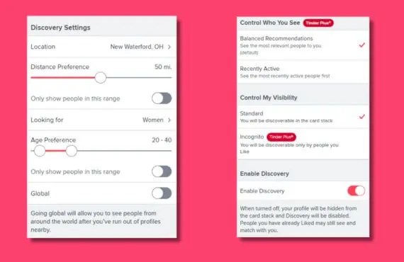
Discovery Settings
You can find the Tinder Discovery Settings located along the side menu. Below the search parameters, there’s a menu option called “Enable Discovery,” which makes your profile visible to other Tinder members. If you want to take a break from using the app, you can turn the switch off, and your profile won’t be shown in the card stack. Several search and setting options require you to upgrade from free membership to a paid subscriptions plan:
- Control Who Sees You (Tinder Plus): See which members were most recently active on their accounts.
- Control My Visibility (Tinder Plus): You can switch to incognito mode if you are using Tinder Plus, and you’ll only be found by members you ‘like.”
Tinder Profiles
Now, let’s look at the profiles in the card stacks.
Tinder was the pioneer for swipe-style dating profiles, and it’s an excellent design that’s served them (and the industry) quite well!
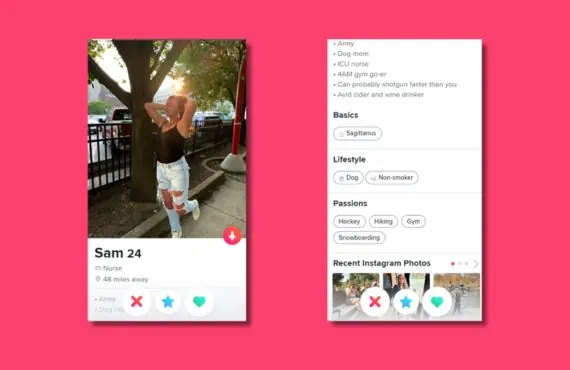
Access profile suggestions by clicking on the Tinder logo in the top left-hand corner of the screen. The card stacks will appear in the middle of the screen, where you can begin looking for your ideal match.
You’ll see that member’s main profile photo, name, age, and how far away they are from your current location. There are also a ton of buttons along the bottom of the screen that allows you to interact with the profile.


The Yellow Button
For any mistakes you might have made, be it “liking” a member when you meant to skip them or vice versa, you can click on the redo button to fix the slip-up. Premium members get unlimited redos!

The Red Button
Click on this one if you’re uninterested in that member. The red “x” is the skip button, and you’ll move on to the following profile.

The Blue Button
There are “likes,” and then there are “super likes.” Clicking the blue button means you’re super interested in that profile. Immediately, your chances of matching jump by 3x. Free members can get one “super like” each week, while premium members get five.

The Green Button
Clicking on this button means you “like” that member.If you’re using the mobile app, this is the well-known “swipe right” option.

The Purple Button
This is the button with the lightning bolt icon. Clicking on this one lets your profile become one of the top profiles for your area for an entire half hour.It’s a feature for paying members only.
Profile Appearance
In the image, you can see the profile’s appearance if you click on the small “i” icon. You can scroll down to view:
- Basic information
- Passions
- Lifestyle choices
- Other helpful facts
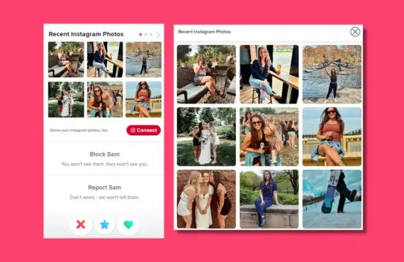
Instagram Integration
When you start getting toward the bottom of the profile, you’ll see that some members have integrated their Instagram photos into their Tinder profile. You can click to enlarge the image and view them right there, or you can connect directly to Instagram.
Based on what we’ve seen by testing out Tinder and using it to find matches and dates that align with our parameters, it lives up to the hype it’s gotten for the last several years. Tinder is easy to use, and the way they display their profiles is pleasing to the eye.
Editing Your Profile
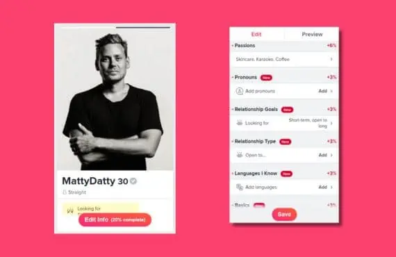
Developing your Tinder profile is a super easy task. All you need to do is click on the icon with your profile photo and name.
A small red button will be at the bottom of your photo, saying how much of your profile has been completed. Click on “Edit Info,” and you can scroll down to add changes or edit current information if needed. Besides each section, there are percentages showing how complete each part of your profile is now. Ideally, you want each section to be 100% completed so your profile can be as effective as possible!
For more insights into the popularity of the Tinder dating app, check out Tinder and the Age of Instant Gratification.
Bumble
Bumble has certainly gotten a lot of buzz over the past several years. They have a unique mission of allowing women to be in the driver’s seat when it comes to interactions on the app. Women are the ones who get to send the first message! But what are the user experience factors and interface features that make this platform one of the best dating apps? Let’s find out!
To learn more about the Bumble dating app, you can read our entire review of the app here!
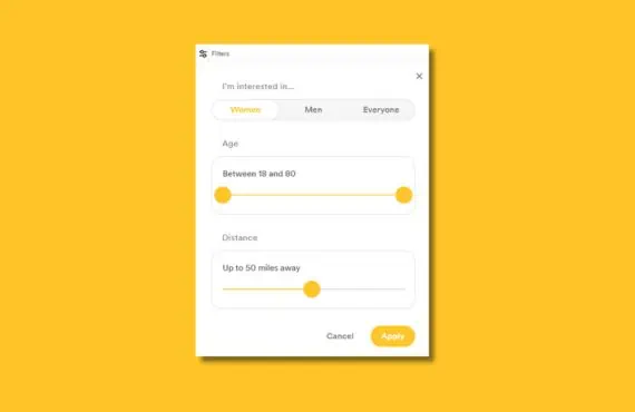
Bumble Search Terms
Using the search filters for the free Bumble membership is simple. You can access the search options by clicking the “Filters” icon at the top of the page. We appreciate how simple Bumble made the entire process of making changes to its search terms.
Three main filtering options are available to free members, including gender, age range, and distance (based on your location). Bumble’s search filters are minimalistic, so we cannot say much more. They’re simple and to the point! We’re glad that Bumble doesn’t complicate things in that regard.
Swipe-Style Profiles
Let’s check out the Bumble profiles. They come in the “swipe-style” format like Tinder, and they allow you to get through an extensive catalog of members in a short time.
With a lot of confidence, Bumble has some super attractive profiles. They’re so good that we’d venture to say they’re even better than Tinders. They take up more of the screen, so the profile photo and basic information are much more prominent and easier to read.


Double-Paneled Photos
You get each member’s photo, name, age, and occupation on the top page. Then you can scroll down to read the rest and see additional images. Some members will have a self-authored “About Me” section on the second part of their profile, along with information like height, exercising/drinking/smoking habits, star sign, and the relationships they’re interested in finding.
Some profiles will have double-paneled photos on the lower pages, but some will have a single picture with an interesting fact on the other side. An example would be “the quickest way to my heart is…” or “perfect first date,” along with their answer. The last page of the profile will typically reveal that member’s location and hometown.
And, of course, what swipe-style dating profile would be complete with the function buttons that allow you to interact with the profile? Here are the option and how they’re used to communicate with other members of Bumble.

The “Back” Button
There are “likes,” and then there are “super likes.” Clicking the blue button means you’re super interested in that profile. Immediately, your chances of matching jump by 3x. Free members can get one “super like” each week, while premium members get five.

The “X” Button
You click this button if you’re uninterested in the profile.

The “Star” Button
Another paid member feature, the star button is a “superlike” option showing your interest in this member.

The “Checkmark” Button
This button is the equivalent of “swiping right” on the profile. It means that you like the member that you’re viewing.
If you want to discover additional Bumble features that enhance the overall experience, read The Bumble Boost to get the most out of interacting with your daily matches!
OkCupid
OkCupid is a primary matchmaking platform in 2026. Their unique contribution to the online dating table is their knack for matching singles based on mutual interests and beliefs. They have 10 million active members and around 1 million daily logins to the site each day. But in addition to their matchmaking process and deep dating pool, they also have a great website and app design worth discussing!
Preferences
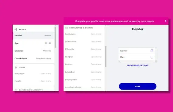
To access OkCupid’s search filters, click on the icon with your profile photo and name, and then click on “preferences.” A question might appear for some of the search terms you set: “Is this a dealbreaker?” By keeping this setting turned on, OkCupid will filter out the profiles that don’t adhere to this criterion.
At the top, you’ll find the primary search terms: gender, age, distance, and relational goals. You can scroll down the list, though, to search using more detailed filters like appearance (height and body type), background/identity (ethnicity, religion, politics, etc.), lifestyle (eating/smoking/diet), and family (pets or kids).
Discover (Narrow Your Search)
The swipe-style dating profiles found at OkCupid fall under the “Discover” tab, but several options below let you filter out the search by other metrics. This isn’t something we saw on sites like Tinder or Bumble, so it stood out to us!
We liked that OkCupid gets more detailed with its search terms and offers these metrics as options to its members. We can see why so many people are using the service in 2026 and why there have been so many successful parings since the website and mobile app launched. OkCupid is doing a phenomenal job honing the search process to help its members find their perfect match.

- Recommended: These are the general match recommendations from OkCupid, which you’d find using any other dating platform.
- Cupid’s Picks: These are curated just for you, where you have a higher chance of matching due to compatibility.
- Match %: These matches are the profiles that rate the highest when it comes to your overall compatibility score.
- Passport: Here, you’ll find international dating opportunities.
- New People: Recommendations are based on the newest people to the OkCupid dating app. This filter is for paying members only.
- Online: The profiles shown here will be of members currently using OkCupid (logged into their account).
- Popular: Get profile recommendations for members who receive the most attention from other users. This filter is for paying members only.
- Nearby: See profile recommendations that are close to your location.
OkCupid Profiles
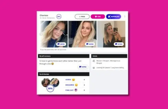
Now let’s examine the OkCupid profiles. We’ll start by saying that they don’t look as good as the ones at Tinder or Bumble (in our humble opinion), but they are incredibly informative, more so than the primary competitors. Let’s show you what we mean by that!
One of the cool features of the swipe-style profiles at OkCupid was the compatibility score. They’re percentages that appear at the top of each profile suggestion. This lets you see how much your profile matches up with another member. We found these to be an excellent way of narrowing down which profiles are worth pursuing.
There are also three options along the top of the profile where you can interact with that member:

Pass
This button is the equivalent of “swiping left.” It means that you’re not interested in the profile.

Like
Click here to show your interest.

Super Likes
You’re interested in this member beyond a simple “like.” Click here if this is a profile that makes it to the top of your interest list.
Profile Continued
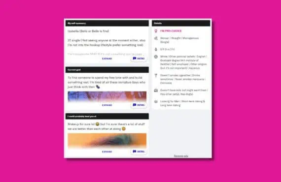
Below the photos and interaction buttons are the rest of the profile. Many members will do a self-authored summary of themselves to expand upon their basic profile information. There’s even a section where members can expand upon their current relational goals to give you a better idea of what they’re looking for.
All in all, these OkCupid profiles seemed more robust and chockful of details than Tinder or Bumble. OkCupid is intent on developing relationships around its members’ similarities regarding thoughts, beliefs, interests, or hobbies. In contrast, Tinder and Bumble are based more on simple information and looks.
Are you interested in hearing more of our thoughts on OkCupid? Here’s our comprehensive review of the dating app: OkCupid Dating App Review
Hinge
Hinge has a high volume of daily customers, but they encourage their members to delete the app as soon as they’ve found that special someone! Along with treating its customer base with an open hand, Hinge knows their stuff when it comes to an intuitively designed dating platform and how important the user experience is to those using its product.
Keep reading to learn more about the overall user experience we found at Hinge. For the rest of our appraisal of the mobile app, we recommend you read our Hinge Dating App Review.
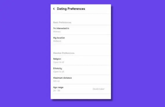
Dating Preferences (Search Filters)
All menu options using the Hinge dating app will appear at the bottom of the screen. Click on your profile photo icon and select “Dating Preferences” to change your search terms or filter settings.
Free member search terms include gender, location, distance, age range, religious beliefs, and ethnicity. To access any other search terms, you need to become a paid member of the platform. Like many of the dating apps we’ve already reviewed, Hinge’s search terms are simple and easy to set so you can find the right match.
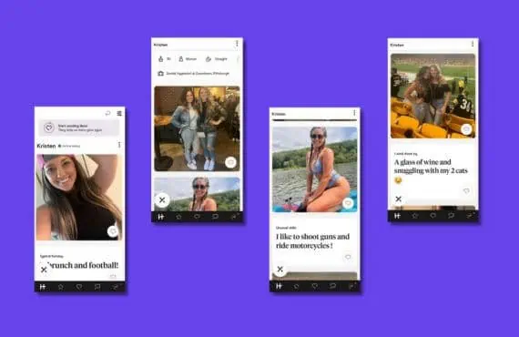
Swipe-Style Profiles
Once you’ve selected a member profile, you can scroll down to learn more about your match suggestion: age, occupation, location, and others. Scattered throughout the profile are additional photos and small facts/tidbits (many of which are self-authored) that help you to learn more about your match’s personality, style, or flair.
Something a little different about the Hinge profile is that there’s only a skip option at the bottom of the page. This is the “X” button, which lets you skip the profile if you’re uninterested.
Instead of one “like” button, Hinge profiles have multiple “like” buttons attached to photos and bio information. Not only can you learn which Hinge members have liked your profile, but you can discover what their favorite parts of your profile are!
Coffee Meets Bagel
Coffee Meets Bagel is another modern dating app that’s been on the scene for over ten years, first appearing as a pitch on Shark Tank in 2012. What it’s grown into is a top-notch platform for finding serious, meaningful relationships working off a vast dating pool of over 11 million active members. But there’s also the usability factor, the design choices and intuitive features, that’s made Coffee Meets Bagel a dating app that attracts so many online daters!
If you’re looking for more information on Coffee Meets Bagel before joining their ranks, read our take: Coffee Meets Bagel App Review
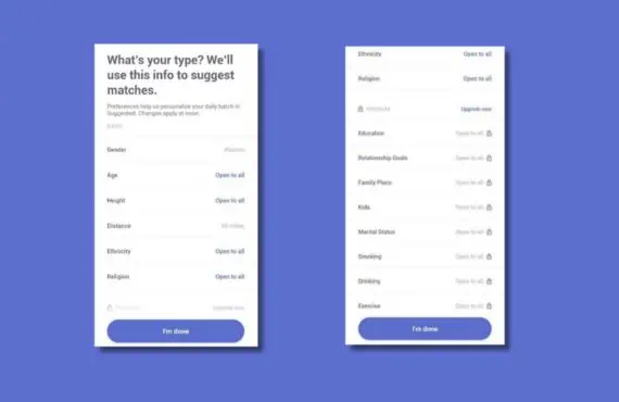
What’s your Type? (Search Filters)
Click on the search filter icon at the top of the main screen to access your search terms.
Some free members can use it, but others take your search to the next level and can only be used by paying members.
Free Member Search Terms
- Age range
- Gender
- Location or distance
- Height
- Religion
- Ethnicity
Paid Member Search Terms
- Relational goals
- Level of education
- Drinking or smoking habits
- Family plans
- Kids
- Marital status
- And many more
We had no problems or issues with making quick, suitable adjustments to our searches for the correct matches. CMB makes the entire process easy; we can’t help but feel this is one of those intuitive design choices that makes the app easy to use and love!
CMB Swipe Profiles (Discover)
Because Coffee Meets Bagel is geared toward meaningful relationships and connections, the profiles generally have more bio information than photos. These profiles let you learn more about your matches beyond their looks.
If you haven’t noticed already, the CMB profiles are composed of the search term criteria. Some profiles contain more detail than others, but that’s largely left to each member’s discretion (what they prefer to share and not share). CMB profiles are robust and well-rounded, letting you do a lot of good research on your matches before beginning a conversation.
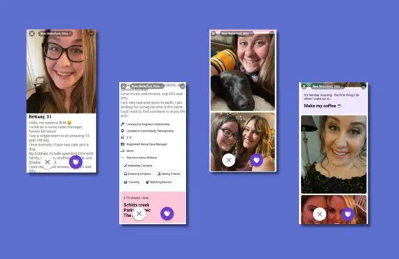
Skips
This is the “X” button to show that you’re not interested in the profile.

Likes
Hit the heart button to show that you like the profile.

Send Messages
While the other two options are for free members to enjoy, sending a message is for premium members only. Click on the speech bubble icon to send a message to your match suggestion.
Having Trouble Choosing a Dating App?
Because the five dating apps we featured in our discussion on user interface and experience are so popular and effective with the public, we completely understand that you might struggle to pick just one to use! If this is the case, we recommend you read a few of our comparison pages which provide a more thorough breakdown of what makes each dating app unique in its own right: